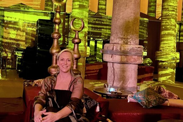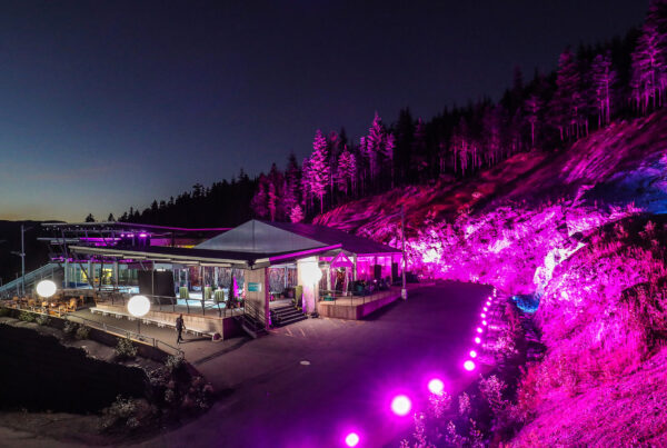


“Engaging all Senses”
In the place where it all began, PDS, rang in their 20th anniversary with a team celebration, new branding, and a heartfelt, “thank you,” to an audience of industry colleagues, clients, family and friends.
One of western Canada’s most acclaimed and creative destination & event management companies, Pacific Destination Services (PDS) was founded in 1998 by Joanne Burns Millar who cheered her team to the stage for a well-deserved and rare moment in the spotlight of the packed house at the Vancouver Club.
“It’s quite surreal to consider that PDS was formed two decades ago,” said Burns Millar, “It has been a remarkable, rewarding and fulfilling journey for me and for each member of our team. Back then, we were fearless, ambitious, and maybe just a little bit naïve. We had a small book of business to start with, some raw rookie talent and a whole lot of determination. Looking back, I think we had a pretty good recipe for success.”
Creating elevated experiences for corporate attendees that captivate and inspire connection is the hallmark of PDS, thanks in large part to the creative vision of Director of Events, Terri Samson, whose 20th anniversary with PDS coincided with the event, cleverly dubbed “Purple Reign.”
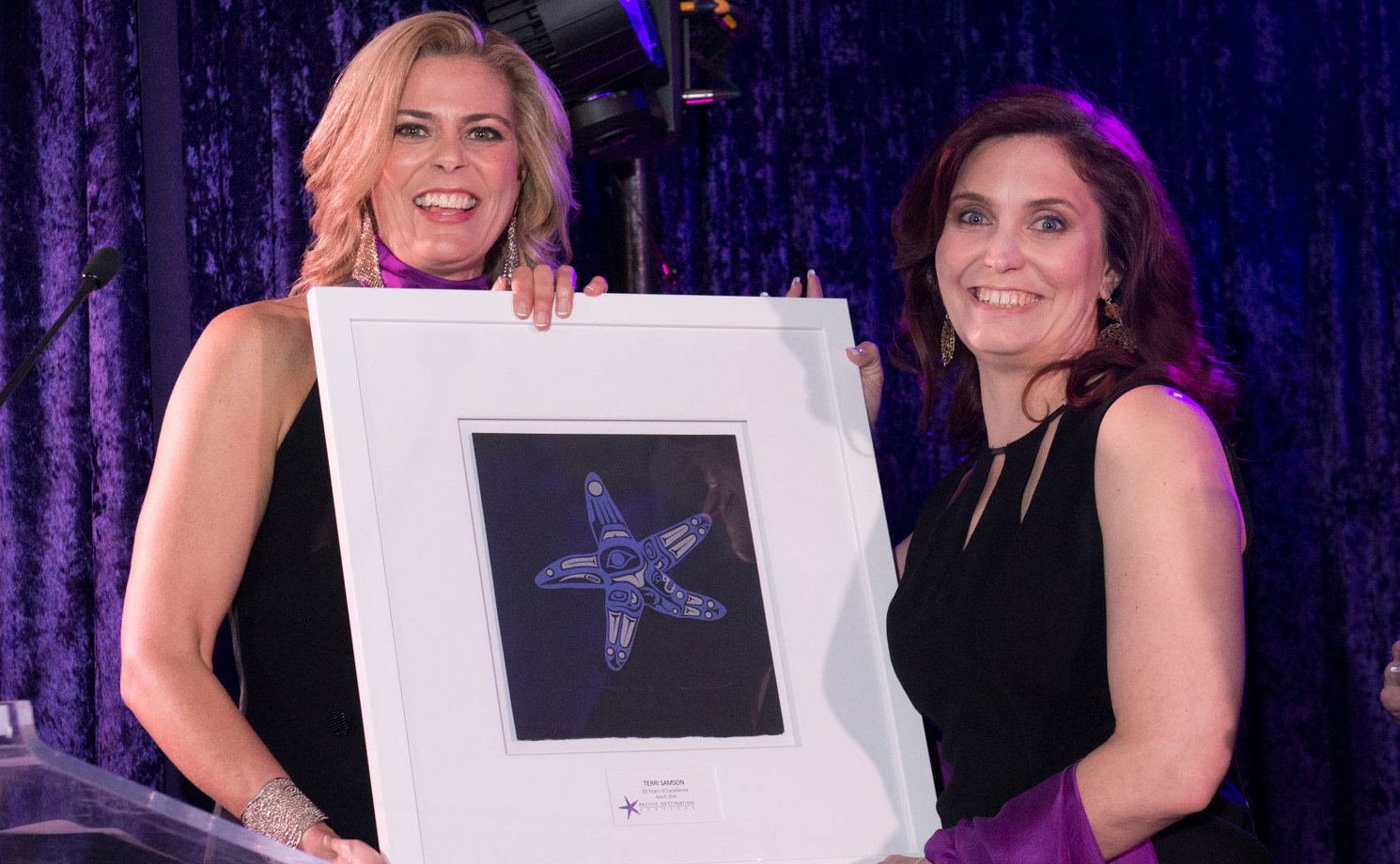
“Terri, constantly amazes me,” said Burns Millar as she presented Samson with a raven print by celebrated Haida artist April White to commemorate the
milestone occasion. “She has endless capacity, a constant thirst for knowledge, and an irrepressible desire to achieve. Terri is a trusted and respected expert in the field of event management, admired by all who work with her.”
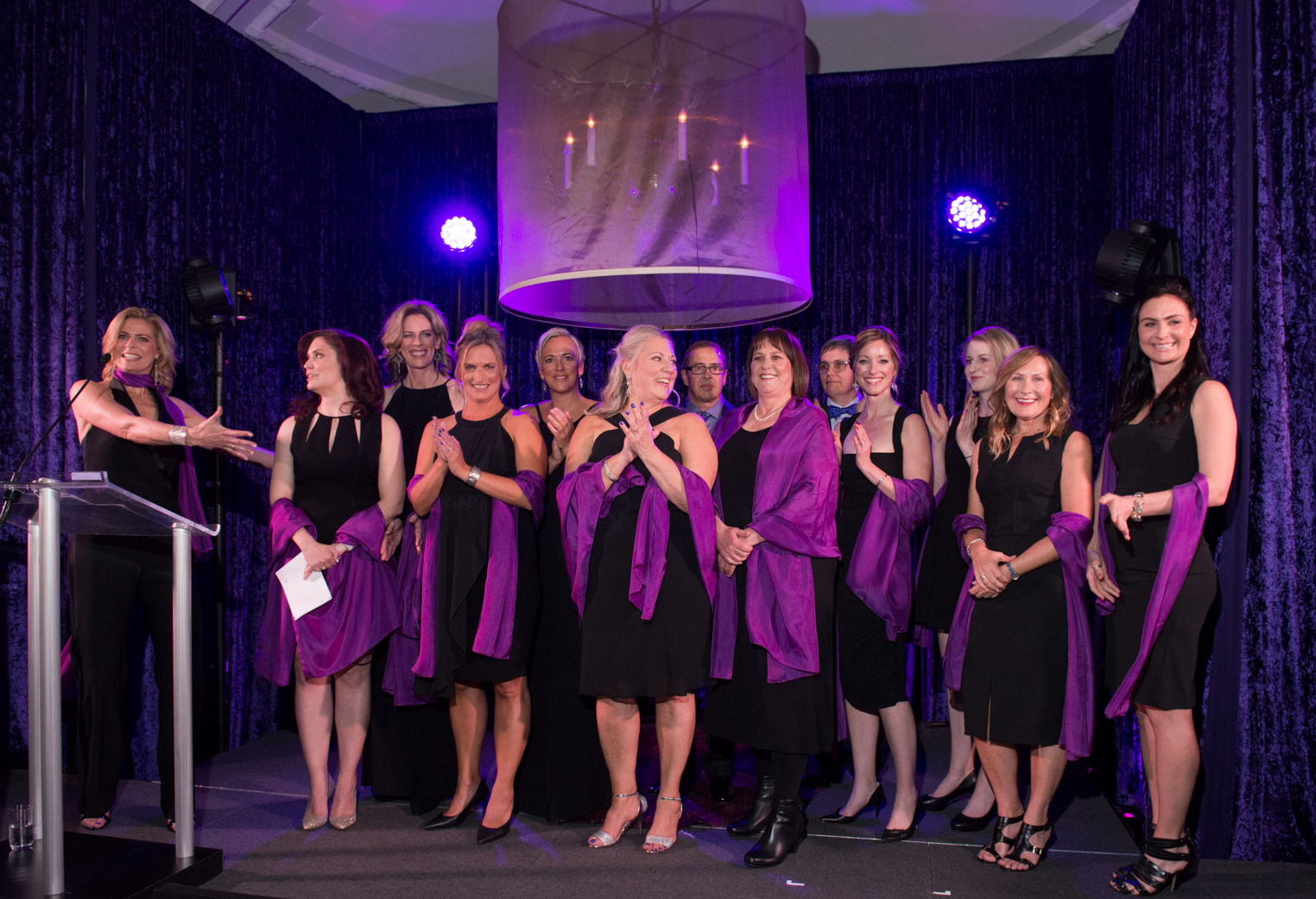
Known by colleagues and customers alike as “Team Purple” for their signature colour palette, Burns Millar revealed a refreshed corporate logo to the assembled group. Having morphed from coastal sea star to dynamic starburst, the logo represents PDS’s growth over the years.
“Our sea star logo has served us very well,” said Burns Millar. “The sea star has represented our coastal roots and has signified creativity, inspiration and
teamwork. As the company has expanded our reach to the Rocky Mountains, we believe it is time to burst forward with a new look and a new logo. We are very excited about the new “starburst ” which, to us, represents the convergence of our clients and guests within our destinations, the explosion of talent and imagination of our teams coming together, and the excitement and power generated by the work that we do. The purple is still with us, but the sea star has retired for a well-deserved rest!”


View PDS 20 year video here – https://youtu.be/FILWZzzY9H8
For PDF Version of Press Release – PDS-20th-PressRelease